Reflection
Hart – infographic reflection
The biggest challenge in completing this assignment was deciding just how to arrange the information in the most aesthetically pleasing way possible. I tried out all of the online infographic makers and finally settled on easel.ly due to the user friendly format. As I began working, the software got very choppy making precise movements and placements of objects very tricky to do well, leading to some frustration. I stuck with it though, because easel.ly seemed to lend itself to customization the most; many of the others had templates that were difficult to change in my opinion.
An infographic is a graphic presentation of information. It is a mix of both visual and verbal communication. To me, infographics seems more geared towards the digital realm, i.e. computer-generated, as opposed to hand-made. The visual elements could be in the form of graphs, maps, timelines, charts, concept maps or groupings, graphic organizers, or some combination of these. A poster is much the same thing, but to me a poster would be made by hand and presented in a physical form on a large poster paper. In school, we have always done “poster projects” where the students make their own design and layout with paper, glue, markers, etc., whereas an infographic seems like a more professional, computer-generated image found in textbooks or on websites.
If assigning an infographic or poster project to my students I think it would be helpful to have a step-by-step process for creating one. I know that this might diminish creativity for some of the more artistic students, but I know from experience that without concrete guidelines, many of the students will be lost when making something like this. For those who want to step outside of the guidelines and go their own way, I would certainly allow that, but I think it’s important to have detailed instructions for what is expected on the poster/infographic, or there is no telling what might be submitted. I would first give them the website to use when creating the project, their topic, the exact information needed to be researched and displayed, and the number of images or graphics needed. All of this should be clearly laid out in a rubric.
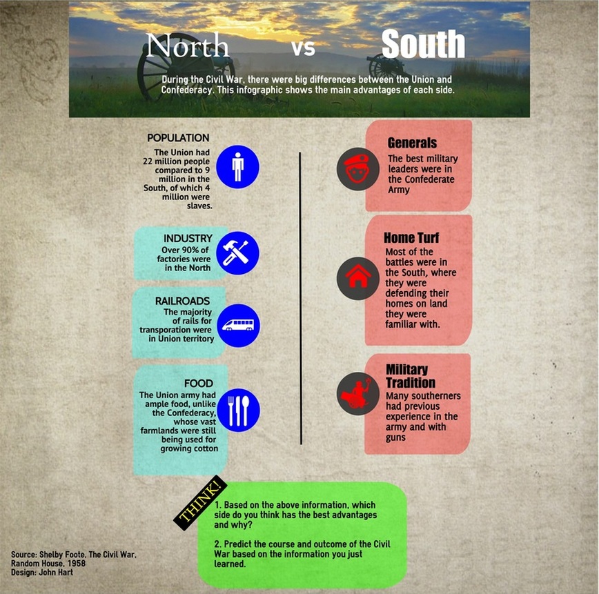
I think the infographic I made would be of great use in the classroom in teaching high school American History. The subject is one of the subsets of the Georgia U.S. History standards that students are required to know. In other words, the information in this picture is critical information that shows up on year-end standardized tests. I think presenting the topic like this is in line with dual coding theory as well as multimedia instruction in that it has both verbal (words on the page) and visual (graphics, colors, pictures) information that allow learning through different brain pathways simultaneously, increasing comprehension and retention.
The written words in the infographic are the heart of what is to be learned; the visuals supplement and reinforce that information. Nest to each bullet point about the advantages of both North and South in the Civil War, there is a graphic with a small icon representing that point.
For example, the Union had more food during the war, and there is a utensil set next to that information. These visual cues, along with the written information, are the essence of dual coding and multimedia learning.
In designing this infographic, I remembered to use the principle of the rule of thirds. Having each list of advantages run right down both lines of the left and right third lines lends a strong balance to the image. Remembering an important rule from the title of one of our textbooks, I left ample empty space so as not to overload the infographic with too much visual content. This is not easy for a history teacher who was taught by example to cram as much information as possible into instruction. The basic message that I want to convey is there, and there is no extraneous information. I also used contrasting colors for the bullet points, drawing the eye to each graphic. In the same way, the reverse text “THINK” at the bottom of the page was set up to draw the eye with the yellow text popping over the black background and lead the reader to the first question in the box at the bottom. Unfortunately, the colors are not as bright and vivid in the infographic after uploading it to the Weebly website, especially the yellow text. I’m not sure of the reason for this; the jpeg downloaded from easel.ly looks fine (I downloaded the “high quality” image), but when transferred to the webpage, it looks a little washed out and blurry.
In choosing a photograph for the info infographic, I resisted a distracting or busy war image and opted for a now quiet battlefield, contrasting with the violent subject matter of the topic. I also resisted the temptation to put more images in the infographic, instead letting the graphics and simplicity of the infographic convey the relaxed and uncluttered tone.
I think that this infographic has great value in a high school history course. I will use this infographic as an introductory piece that should lead to the discussion questions at the bottom of the page. I think these questions could alternately be done individually by students with pencil and paper, in small group discussions, or whole group discussion in advanced classes.
The biggest challenge in completing this assignment was deciding just how to arrange the information in the most aesthetically pleasing way possible. I tried out all of the online infographic makers and finally settled on easel.ly due to the user friendly format. As I began working, the software got very choppy making precise movements and placements of objects very tricky to do well, leading to some frustration. I stuck with it though, because easel.ly seemed to lend itself to customization the most; many of the others had templates that were difficult to change in my opinion.
An infographic is a graphic presentation of information. It is a mix of both visual and verbal communication. To me, infographics seems more geared towards the digital realm, i.e. computer-generated, as opposed to hand-made. The visual elements could be in the form of graphs, maps, timelines, charts, concept maps or groupings, graphic organizers, or some combination of these. A poster is much the same thing, but to me a poster would be made by hand and presented in a physical form on a large poster paper. In school, we have always done “poster projects” where the students make their own design and layout with paper, glue, markers, etc., whereas an infographic seems like a more professional, computer-generated image found in textbooks or on websites.
If assigning an infographic or poster project to my students I think it would be helpful to have a step-by-step process for creating one. I know that this might diminish creativity for some of the more artistic students, but I know from experience that without concrete guidelines, many of the students will be lost when making something like this. For those who want to step outside of the guidelines and go their own way, I would certainly allow that, but I think it’s important to have detailed instructions for what is expected on the poster/infographic, or there is no telling what might be submitted. I would first give them the website to use when creating the project, their topic, the exact information needed to be researched and displayed, and the number of images or graphics needed. All of this should be clearly laid out in a rubric.
I think the infographic I made would be of great use in the classroom in teaching high school American History. The subject is one of the subsets of the Georgia U.S. History standards that students are required to know. In other words, the information in this picture is critical information that shows up on year-end standardized tests. I think presenting the topic like this is in line with dual coding theory as well as multimedia instruction in that it has both verbal (words on the page) and visual (graphics, colors, pictures) information that allow learning through different brain pathways simultaneously, increasing comprehension and retention.
The written words in the infographic are the heart of what is to be learned; the visuals supplement and reinforce that information. Nest to each bullet point about the advantages of both North and South in the Civil War, there is a graphic with a small icon representing that point.
For example, the Union had more food during the war, and there is a utensil set next to that information. These visual cues, along with the written information, are the essence of dual coding and multimedia learning.
In designing this infographic, I remembered to use the principle of the rule of thirds. Having each list of advantages run right down both lines of the left and right third lines lends a strong balance to the image. Remembering an important rule from the title of one of our textbooks, I left ample empty space so as not to overload the infographic with too much visual content. This is not easy for a history teacher who was taught by example to cram as much information as possible into instruction. The basic message that I want to convey is there, and there is no extraneous information. I also used contrasting colors for the bullet points, drawing the eye to each graphic. In the same way, the reverse text “THINK” at the bottom of the page was set up to draw the eye with the yellow text popping over the black background and lead the reader to the first question in the box at the bottom. Unfortunately, the colors are not as bright and vivid in the infographic after uploading it to the Weebly website, especially the yellow text. I’m not sure of the reason for this; the jpeg downloaded from easel.ly looks fine (I downloaded the “high quality” image), but when transferred to the webpage, it looks a little washed out and blurry.
In choosing a photograph for the info infographic, I resisted a distracting or busy war image and opted for a now quiet battlefield, contrasting with the violent subject matter of the topic. I also resisted the temptation to put more images in the infographic, instead letting the graphics and simplicity of the infographic convey the relaxed and uncluttered tone.
I think that this infographic has great value in a high school history course. I will use this infographic as an introductory piece that should lead to the discussion questions at the bottom of the page. I think these questions could alternately be done individually by students with pencil and paper, in small group discussions, or whole group discussion in advanced classes.
